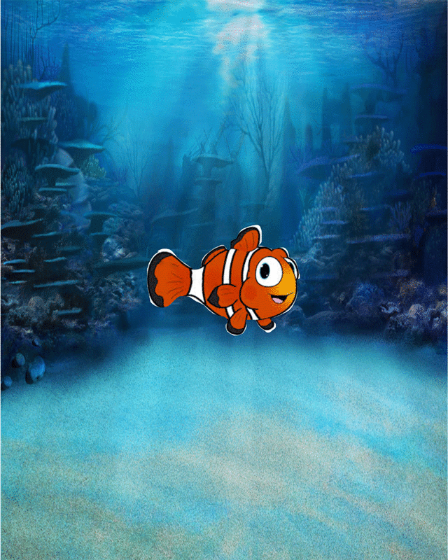
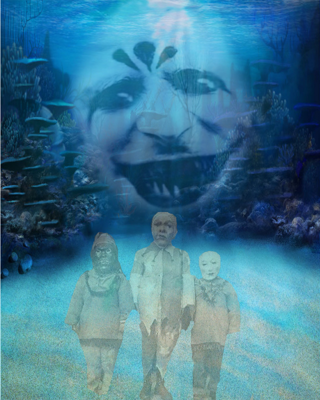
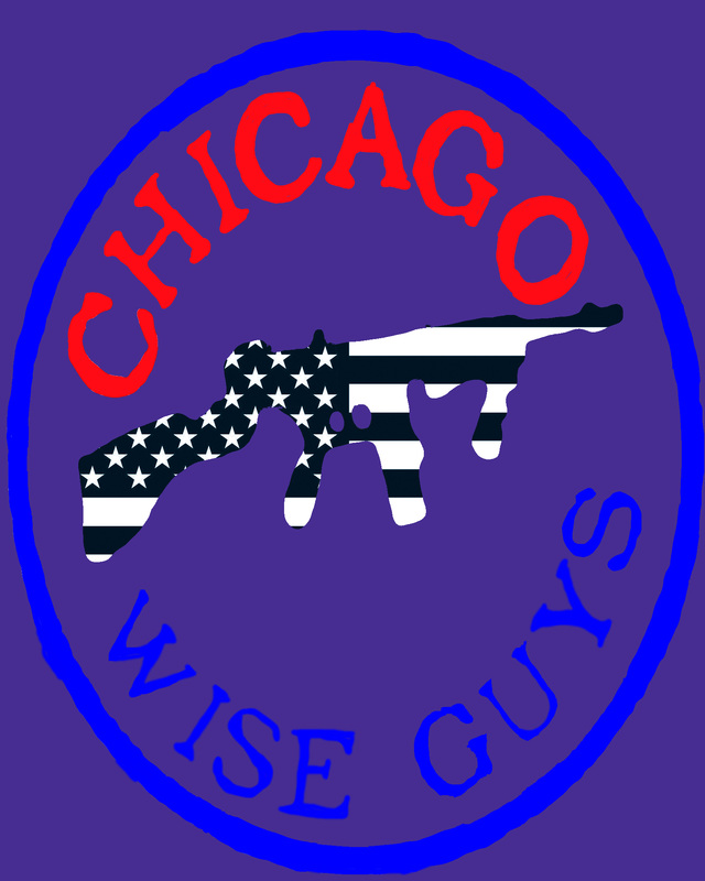
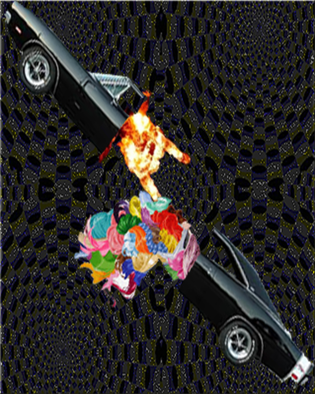
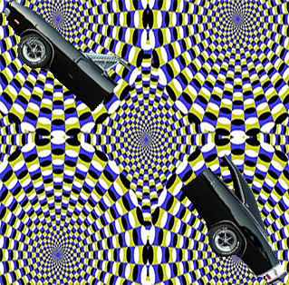
From this course I have gone from no experience with Photoshop to being able to make a GIF. i learned how to make a layer mask and make an image disappear and reappear. my favorite project that i have done this year is the t shirt design. i get s scene of satisfaction of wearing a piece of artwork that i had created. the shirt itself is a tangible piece of this class that i will treasure for a long time. the digital art format that i love the most would have to be graphic design because i will use it later in life for my career in game design. as i stated before i will be using the skills that i have learned in this class for my career in game design. what i would like to explore more with this class if i had another semester is more with animation and the process behind it.
0 Comments
The reason that is chose this logo is because it is an amazing movie and i love some of the dialog from this movie. the reason that the designer used this font is because it is based in a theme park, so they used the old style neon lighting as the tittle. the colors that were used in this poster are a lot of black and grey colors because it is a post apocalyptic setting. the way that the words are arranged in this setting are around the characters that are form the movie. for my logo i will be trying to use this post apocalyptic coloring for my logo.
The reason that i used this picture is because it was around Halloween and i wanted it to be creepy. i decided to make it creepy for that reason. what i had learned from this project was how to use a layer mask, i really enjoy using that. the mood that you get from looking at this picture is creepy and scary.as you can clearly see i yet again used the Chicago Wise Guys Racing Circuit. i have kept the name, because there is a possibility that this could be the new logo, i have added a personal touch with the purple as it is my favorite color.
The logo that i used for inspiration is the Chicago Wise Guys Racing Circuit. I used it as a curve and then changed the color to the school colors. and made it school oriented.1. add more explosions
2. blur it more 3. add another background, possibly another image 4. mess with the colors, possibly do a black and white 5. splice the car more, possibly another cut Shape - is a 2-dimensional line with no form or thickness. Shapes are flat and can be grouped into two categories, geometric and organic. - See more at: http://www.incredibleart.org/files/elements2.htm#sthash.gSwU77K4.dpuf
the cube, a shape is exploding into smaller cubes what i have done to my picture in Photoshop is start from scratch, with no knowledge of what i am doing, to learning how to liquefy, and manipulate the image to my imaginations extent. i titled my work bensfield_prorate. some elements that i incorporated into this piece of art is color change, to black and white, i messed with the color balance and added my name to the picture with a colored rectangle. i have a mixed mood with my picture, it gives an old style vibe with the black and white and a cool modern vibe with the colorful rectangles. the statement with my imagery is, the basics, having no idea what i am doing and making something somewhat decent. i showed this in my piece is the somewhat basic looking picture, “ black and white”, to the colorful rectangle with my name in it. this piece means to me is, coming from nothing and producing something that isn't a complete failure. the most successful thing about my work is changing the color, it went from having color to going to a simple black and white. something i would like to improve on is adding more layers and learning how to liquefy the image.
|
Peter Bensfieldwhat i have done to my picture in photoshop is start from scratch, with no knowledge of what i am doing, to learning how to liquify, and manipulate the image to my imaginations extent. i titled my work bensfield_portrate. some elements that i incorporated into this piece of art is color change, to black and white, i messed with the color balance and added my name to the picture with a colored rectangle. i have a mixed mood with my picture, it gives an old style vibe with the black and white and a cool modern vibe with the colorful rectangles. the statement with my imagery is, the basics, having no idea what i am doing and making something somewhat decent. i showed this in my piece is the somewhat basic looking picture, “ black and white”, to the colorful rectangle with my name in it. this piece means to me is, coming from nothing and producing something that isn't a complete failure. the most successful thing about my work is changing the color, it went from having color to going to a simple black and white. something i would like to improve on is adding more layers and learning how to liquify the image |